Understanding the Existing Brand
Before beginning the redesign, I evaluated the current Foxwoods identity to understand what was working and where opportunities for improvement existed. While the original logo carried strong brand recognition, it lacked the flexibility and visual cohesion needed for a contemporary hospitality brand.
A Symbol Rooted in Place
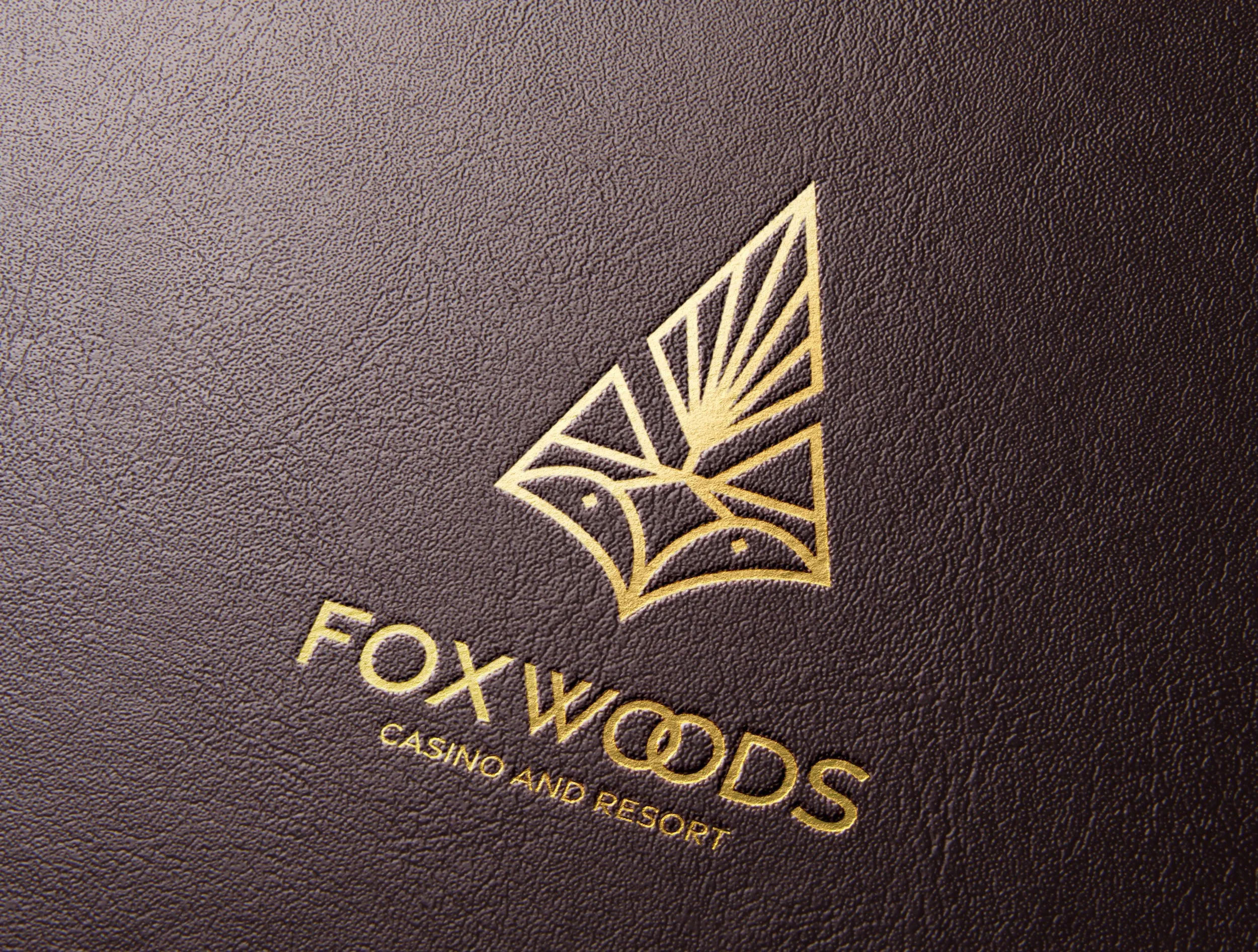
The redesigned mark combines two defining elements of the Foxwoods story: the fox and the forest. The lower portion of the symbol forms a simplified fox, while the upper portion references the pine trees surrounding the resort. Together, these elements create a distinctive mark that reflects both the landscape and heritage of the Mashantucket Pequot Tribal Nation.

Exsisting Logo

Proposed Logo
Building the mark
The final logo combines two symbols central to the Foxwoods story: a fox, representing both the resort's name and a traditional tribal symbol, and a stylized pine tree inspired by the surrounding forests. The tree features seven spokes, honoring the Tribe's seven hereditary leadership families. Together, these elements create a modern identity rooted in the history, culture, and landscape of the Mashantucket Pequot Tribal Nation.

Brand Elements

Typefaces, Color Pallet, & Illustrative Element
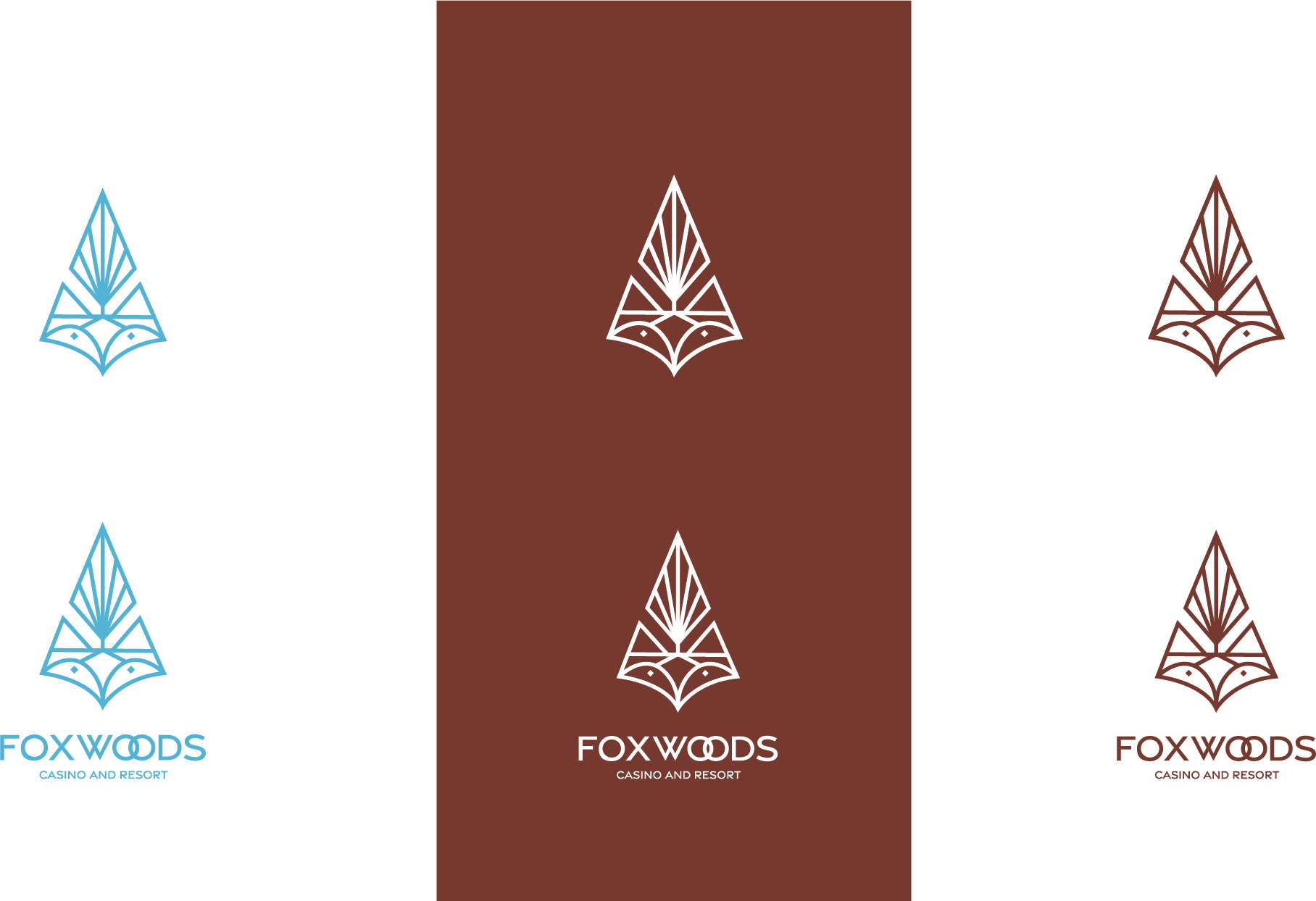
Logo Variations